STONE & WOOD
OVERVIEW
The intention of this project was to design an editorial layout with a focus on visual hierarchy through typography.
The intention of this project was to design an editorial layout with a focus on visual hierarchy through typography.
CONCEPT
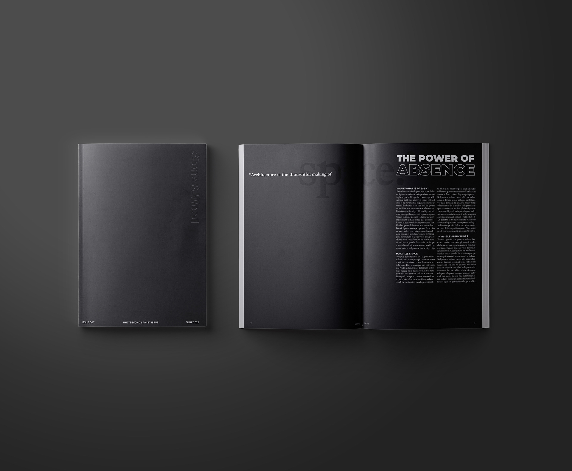
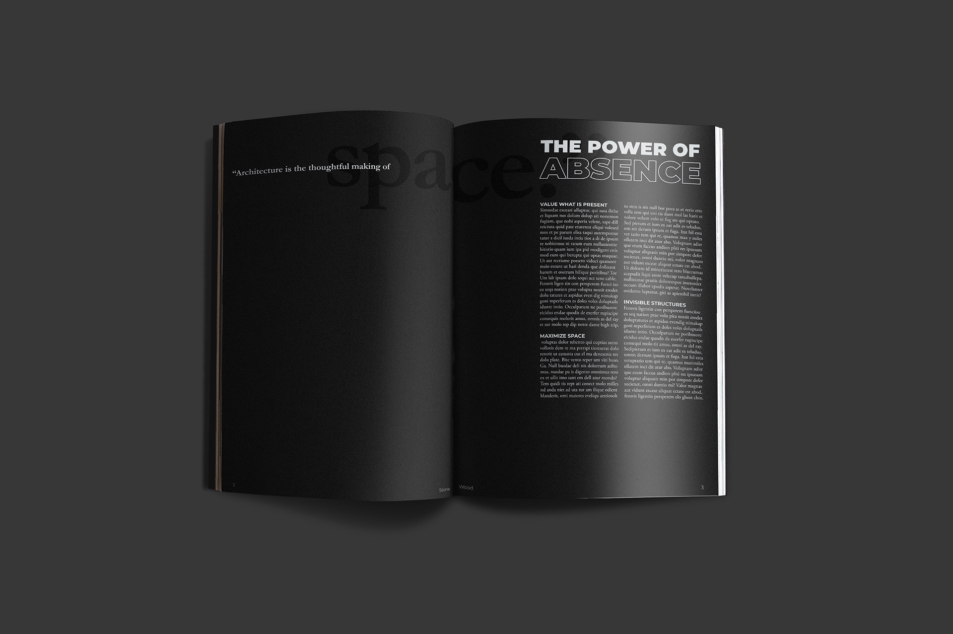
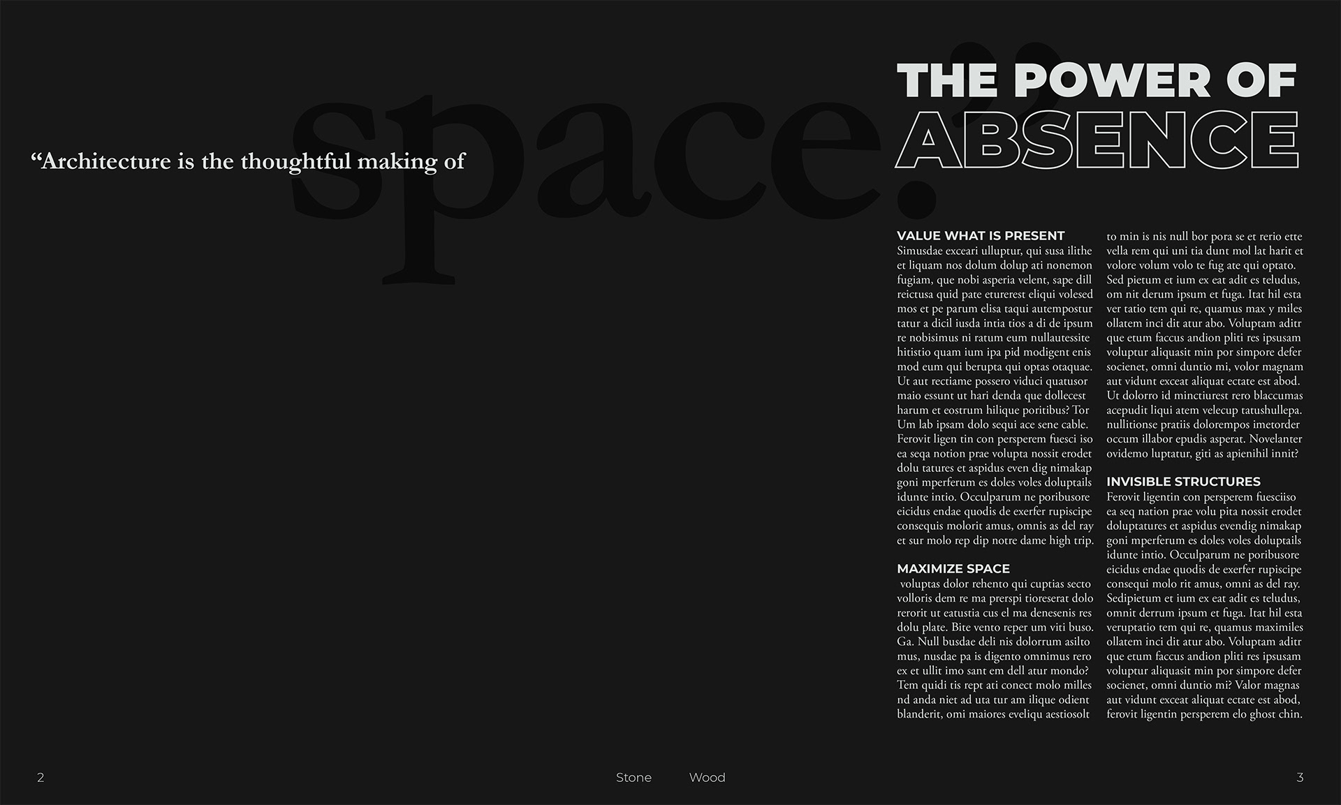
The editorial is for an architectural magazine that specializes in contemporary spaces and minimal architecture. The magazine’s theme of the month was on open space in architecture, this motif directed the layout’s style.
The editorial is for an architectural magazine that specializes in contemporary spaces and minimal architecture. The magazine’s theme of the month was on open space in architecture, this motif directed the layout’s style.
PROCESS
001. Research minimal and contemporary architecture
002. Curate mood board
003. Write magazine brief
004. Construct style guide
005. Sketch layout ideas
006. Refine layout with a pencil render
007. Design digital render
008. Receive feedback on digital render
009. Revise and finalize editorial
010. Create magazine mock-ups
INSIGHT
This project taught me how to balance structure and chaos in a design. Too much structure can be boring, and too much chaos can be messy. Good design should be easy to understand, while bold design should catch the audience off guard. As a general guideline, follow the rules of design and have just one element break the rules in a sensible way.
This project taught me how to balance structure and chaos in a design. Too much structure can be boring, and too much chaos can be messy. Good design should be easy to understand, while bold design should catch the audience off guard. As a general guideline, follow the rules of design and have just one element break the rules in a sensible way.